I LOVE The Shadow. Unlike a lot of purists, though, I also love the Andy Helfer-penned by published by DC in the late 1980s — especially the issues drawn by the great Kyle Baker. I met Kyle a few years ago and got this sketch from him. I also picked up his first Nat Turner graphic novel, which was terrific.
Here's a little side trip to the Silver Age, an issue of Batman that has him matching wits with himself. This is an interesting little story from an era notoriously light in substance. The line of Batman books had been recently invigorated with a new editorial direction (called "The New Look.") For the first time in many years, Batman and Robin were allowed to fight crime instead of aliens and robots. What's interesting is that, during these years, the Dynamic Duo fought plain-clothed gangsters more often than the deformed/costumed criminals they are best known for. During the first year the Joker, Penguin and the Riddler all made an appearance in either Batman or Detective, but the creative team seemed more interested in inventing new villains. Batman #169 is the first appearance of the Penguin in the "New Look" era, but he's changed little from his early days. He's still obsessed with umbrellas and how they can be used in crime, and has no overt interest in hurting anyone. His plan in this issued, titled "Partners in Plunder," is surprisingly clever, though. He begins a wave of chaos in Gotham, flooding streets and stores with wacky umbrellas that cause a lot of confusion — but there doesn't appear to be method to the madness. Batman is sure the Penguin is responsible, but can neither prove it nor figure out the point to it all. The reason is simple: the is no point. The Penguin's plan is to create a criminal "Rorshach blot" layered in possible clues and symbols that have no meaning. He's convinced — rightfully so — that Batman will infer what he will from the "clues" and find a way to keep the Penguin from reaching the alleged goal. Little does he know that the Penguin planted listening devices in a few of the umbrellas confiscated by Batman. He's been listening in on the Dynamic Duo's speculations and likes what he hears. He also know how Batman plans to stop him, which gives him the edge. Even though he successfully pulls off the scam Batman has unwittingly planned for him (the theft of a jeweled meteorite) he fails to get away. During a chase using rocket umbrellas, Robin's lighter weight allows him to overtake the Penguin and throw a lasso around him. It's a victory for the Dynamic Duo, but not one they necessarily earned.
I've collected a few sketches over the years from the annual HeroesCon in Charlotte, N.C. Twice I had particular themes in mind. The first was to get sketches of musicians I liked, the other was to get sketches of Wesley Snipes as Blade. I'm going to share them all over the next few weeks, but thought I'd lead with the strangest: a sketch of Blade by Peter Bagge. I'm pretty sure it's the only time Bagge has ever drawn Blade, which makes this pretty unique.
A look back the Internet message boards in 1977, shortly after the casting announcement for Superman the Movie:
Ladykiller71: WTF? They cast some soap actor as Superman?
SexyLexy: This movie's gonna suck. A bunch of unknown actors, and directed by teh guy who made The Omen? Really? This shows a fundamental lack of understanding about why Superman works.
Supermonkey: If it's not set in the '40s and have SUoperman fighting giant robots, not interested. Hope it tanks.
GO-GO-GODZILLA: Christopher Reeves (?) was choice #547. Every other actor turned it down. Paul Newman wasn't interested, neither was Robert Redford. This smells of FAIL.
FarrahHair: Newman as Superman would have been AWESOME.
3scompany: What about Burt Reynolds?
KISSARMY: Reynold's won't shave his 'stache for nobody. Last time he did some dude got raped in the woods by hillbillies. He's superstitious about it now.
SexyLexy: I wonder of Christopher Reeves is related to George Reeves, the ONE TRUE SUPERMAN. He probably changed his name just to get the part.
GO-GO-GODZILLA: I wouldn't be surprised if they try to make Superman "modern" by having him cuss and making Lois show her tits and shit.
Supermonkey: Did someone say tits?
FarrahHair: I'd pay to see Superman dropkick Barry Manilow into the sun.
KISSARMY: Does anybody care about Superman anymore? Where's my Howard the Duck movie!?
FrodoWasRight145: I was trying to be optimistic about this whole thing but damn, this sounds terrible. And KISSARMY ... Howard the Duck would make a kickass film.
You know what? Screw those Transfomers-meet-Star Wars toys. They suck on every imaginable level, and probably even on a few we can't perceive with our limited human senses.
On the other hand, this Shogun Warriors-style Stormtrooper figure rocks. Here's what the company has to say about this little gem of geekiness:
"Utilizing the same techniques implemented by Japanese toy manufacturers in the 1970s, the Super Shogun is constructed from durable, blow-molded polyethylene with a painted vinyl helmet. The figure is articulated at the neck and shoulders, and includes a removable, highly-detailed BlasTech E-11 laser blaster. The blaster even features a posable stock that unfolds from below the barrel. Collectors of both Japanese and Star Wars memorabilia are sure to be impressed with the care taken to fuse the disparate concepts into a new unique entity."
If there was anything that came close to matching the hysteria caused by the Sears Christmas Wishbook when I was a kid, it was the advertisements for the new cartoon season that appeared in comics in the months leading in. I lived overseas for a few years as a child and, while I was still able to get a few American comics here and there, I missed most of the shows aired between 1979 and 1983. Panadamonium? Meatballs and Spaghetti? These shows are complete mysteries to me. I did have the misfortune of seeing Pryor's Place, though.
Below are a handful of these ads from the golden age of American cartoons I collected from various sources around the net. (Maybe I should refer to it as the "First Golden Age," given the great work regularly done by Adult Swim.)
I'm one of those rare beasts who like the original and "re-imagined" Battlestar Galactica. While I'll concede that the new series is better on pretty much every level, there's still a lot to love about the original, which is more Flash Gordon/Star Wars than The Shield. I had a lot of these cards as a child. Even had some of the Wonder Bread cards, which were printed in better card stock but lacked the crisp design of the Topps series. And what a series it is! Somehow, BSG skirted the rules of non-sport trading cards by producing a massive 132-card set, with a 22-sticker subset. That's twice as large as any single-series of Star Wars cards. BSG burned out quickly, though, and was gone by the end of it's first year. Naturally, it took the Topps series with it, and it would be many more years before BSG returned to trading cards. This series also includes a few cards of my first boyhood crush, Maren Jenson. By all rights, that honor should have fallen on Batgirl, but Maren just happened to be in the right place at the right time, I guess.
REVIEW:
Cover Card: (0 out of 5) Nope. The idea of the "cover card" hadn't really caught on yet at Topps. To add insult to injury, the first card in the set features Lorne Green striking a sexy pose.
Design: (8 out of 10) Crips and bright, though a little generic. While the "cutline" is a little dull, I love how the logo is prominently displayed on the front of each card. (Weirdly, BSG had two different logos, one that appeared on merchandise like cards and comics, and the one that was used in the title credits.) And the design allows for both verticle and horizontal positioning without disruption.
Photography: (9 out of 10) Just short of perfect. This is a case where a card set's reach exceeds its grasp. The cards were produced using (primarily) images from the pilot episode. By trying to squeeze 132 cards from a single film, some of the images get a little repetitive. On the plus side, though, there are a few promo photos used, apparently taken on the Universal Studios lot. Outside of Star Wars, it's hard to find "behind the scenes" cards. Remember what I said about Miss Jansen?
Production: (9 out of 10) Pretty good. Not as sharp and clear as some of the Star Wars cards, but leaps and bounds beter than the photos in the second Return of the Jedi series. There are a handful of dark, grainy photos in this set, something that could have been corrected by reducing the series to 100 cards.
The Other Side: (4 out of 5) A puzzle, trivia and details about the cast and crew. Good stuff, but nothing groundbreaking.
Stickers: (8 out of 10) With a set this ambitious, ,there's bound to be some re-runs. Many (all?) of these stickers reproduce photos already found on the cards. That's not such a bad thing, though. Also, the stickers are based on the designs of the Star Trek/Star Wars stickers, so there's a great sense of lineage in this set.
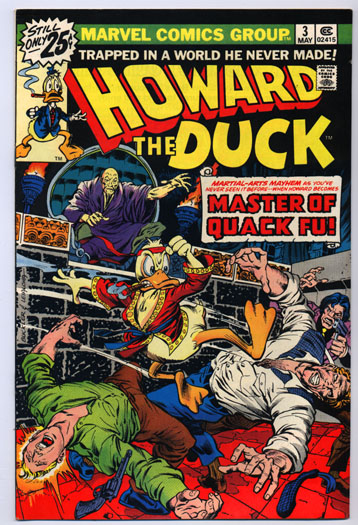
I love me some Howard the Duck, but the book always worked best when it avoided explicit superhero parodies. The weakest issues in the series were parodies of other Marvel titles. Sure, “Iron Duck” and the “Master of Quack Fu” made for some great cover art, but the stories were tepid (Howard as “Son of Satan” is the exception.) The third issue is intended as a lampoon of the kung fu craze of the mid 1970s. The problem is that writer Steve Gerber didn't really know what he thinks about the fad. Howard, of course, hates it, but Gerber can’t eloquently explain why and the book frequently contradicts itself. The story begins with Howard and Beverly leaving a kung fu movie. Howard is clearly disgusted by the violence in the film, calling it “training for the local troops.” He also takes issue with Hollywood exploiting as “ancient tradition” for its own end as he stands on the street shouting at people. All he needs is a box to stand on with the word “soap” written on it. Anyway, the kung fu craze gets out of control when, at a local diner, Howard and Bev see a character named "Count Macho" (based on Count Dante, who ran numerous ads in comics in the 1970s) kill an overzealous karate fan. Early in the issue, Howard proclaims that people who enjoy violence "don't have the mental equipment to be sure they exist." So what does he do when Count Macho kidnaps Bev? He takes a crash course in kung fu so that he can fight back. Like all good liberals (and conservatives, for that) Howard's real concern isn't his own ability to process reality ... it's everyone else's. He thinks he lives in a world of idiots, which is probably true. He simply can't recognize that he's an idiot, too. I'm not really sure what Gerber's message was. It begins as a slam against kung fu movies, but the story would have felt at home in a Shaw Brothers picture. Howard abhors violence, but turns to it the first chance he gets. Because the story has no intellectual center to argue from the issue feels like nothing more than propaganda. "The Master of Quack Fu" features guest art by John Buscema. Frank Brunner quit after drawing the first two issues when Marvel passed on a requested pay raise he believed he deserved for working on one of the company's best-selling titles (right behind Marvel's Star Wars comic at the time.) It was their loss ... Brunner is a fantastic artist. But Gene Colan was waiting in the wings — no pun intended — and became "the" Howard artist for the rest of the title's publication.
Here's a little something I recently picked up on Ebay. I don't see too many people talking about this (probably for fear of creating bidder competition,) but Topps has opened its vaults and is currently selling off a lot of amazing artifacts.
Among them were two little items I picked up: a 1980 4-color positive for the final card in The Empire Strikes Back series, and a 4-color positive for a trading card from the final "orange" series of the original Star Wars set. Here they are:
And here's what the Star Wars card looked like when printed:
Tony Stark paid a visit to Hasbro's showroom at Toy Fair, according to SuperheroHype. How ling before Toy Fair becomes the victim of sprawling excess like the San Diego ComicCon?
Not that Downey's not welcome to the geek party, of course.
I don't spend a lot of time worrying about awards, whether they're mine or anyone else's. But I thought I'd pass along a few names from the recently announced Glyph Awards, billed as "The Language of the Black Comics Community." (Note: I'm awarding brownie points for using Mr. Terrific in the Glyph logo.)
I don't know much about this video, but came across it about a year ago and was floored by its beauty. Titled The Fezt, it was posted by someone called Malpertuis. There's a bit of a language barrier preventing Google searches from being fully effective, though. Watch and enjoy.
Springfield Punx is an art blog created by a guy named Dean Fraser. Over the last few years he's slowly built a catalog of characters, actors and celebrities all drawn in the style of Matt Groening. The art is amazing and makes me wish for a graphic novel done in this style. I'd definitely buy a Simpsonized collection of Mr. Bean comicstrips.
There's a wild assortment of subjects at the blog, ranging from characters like Cobra Commander and He-Man, to Mr. Bean, Elvis and the cast of Lost.
Sometimes, the strangest movies get sequels. I'm not going to go off on a tangent expressing my love for 1982's Tron (there's time for that later.) But, come Dec. 17, 2010, we'll be getting a movie that appears to be a gorgeous bit of cyberpunk escapism that will wash the taste of The Matrix series from our collective palettes.
Tron Legacy.
There's a viral site online called Flynn Lives, not to be confused with Gregory MacDonald's Flynn series of mysteries (nor the Chevy Chase movie Fletch Lives, also based on MacDonald's character.) The site follows the fictitious career of computer designer Kevin Flynn, played in both Tron and Tron Legacy by the great Jeff Bridges.
Flynn Lives recently sprouted a branch. If you visit www.flynnlives.com/zerohour/, you'll be taken to a Flash animation that appears to be a countdown clock to the film's release date. The timer is spelled in binary code using the Yes/No messages from Bit, the R2-D2 character from the original film.
If you haven't seen the demo reel that showed at ComicCon last year, I've pasted it below. It's amazing. And did I mention that Daft Punk is doing the film's score?
World of Hurt is an online comic strip written and drawn by Jay Potts. I'll let him describe the series for you:
"WORLD OF HURT is Super Fly meets The Equalizer.
WORLD OF HURT is the wayward step-child of Ernest Tidyman’s John Shaft and Alex Raymond’s Rip Kirby, desperately trying to live up to the greatness of his forebears."
Now, for the uninitiated, Potts has proven his street-geek cred by name-dropping Ernest Tidyman. If you are only familiar with Shaft via the movies, you really need to check out Tidyman's novels — the literary version is the definition of badass. Potts has also eaten a scorpion and has caught a rattlesnake with his bare hands. I met him last year at the HeroesCon in Charlotte, N.C., but luckily he didn't bring the snake with him.
Above are the first three strips from the World of Hurt series. You can catch up on the rest at worldofhurtonline.com. A collected edition is reportedly forthcoming.
Here, for no reason, is some fairly bad video from Fred and Barney Meet the Thing, and honest-to-god Saturday morning cartoon in the 1970s. This is one of the most bizarre productions from a decade that specialized in bizarre productions (Lidsville, anyone?)
Wow. I used to own a different versions of this set when it was originally released. Topps released two series, as well as two “factory sealed” editions that included bonus cards. This review is for the standard “wax pack” set.
Batman was probably the most popular set of non-sports cards since the original Topps Star Wars series in the 1970s. It was also the swansong for the traditional pulp-style trading cards. Competition from companies like Score were putting pressure on Topps to change its production styles. Upper Deck printed its first series of baseball cards in 1989 - the same year as Batman - and it was clear that the days of pulp card stock were almost over. Trading cards for Gremlins 2 and Robocop 2 continued the tradition, but they were the last of a dying breed. Unfortunately, when the market began to follow the collectors (as opposed to the other way around) it was bad news for all involved. Cards (and comics) stopped being a cheap diversion and became an expensive habit that many delusional people thought would make them rich.
Anyway, time has been good to the first series of Batman cards. I hadn't looked at these in years but was really impressed after finding an affordable set online. I've added about 20 full sets to my collection in recent months, and this is easily the best of them.
REVIEW:
Cover Card: (4 out of 5) The art is a bit of old-school “cut and paste” that uses one of the famous promo shots of Batman and the Batmobile, as well as the movie’s logo. I think the iconic logo would have been a better selection, but the logo is used to great effect on the front of each card.
Design: (9 out of 10) Amazingly simple, but crisp and clean. The typography is sharp and consistent, and the use of the “bat symbol” from the poster is a pretty neat addition to the art. The marketing of the film tended to rely on this image, which was an instantly recognizable icon.
Photography: (10 out of 10) At 132 cards, this is a big series. Still, there are only a few cards that come off as unnecessary and repetitive. Overall the photos are great choices that show off the movie’s cinematography, costumes and production designs (which were its strongest points.)
Production: (10 out of 10) The photos are all bright and clear. Even the spot color reverse sides are clean and easy to read. When it comes to pulp stock, this is as good as it gets.
The Other Side: (4 out of 5) There are no puzzles in this series, but the text on the back (which offers summaries and trivia) is incredibly thorough. While most series settle for a sentence or two, many of these cards have several paragraphs of text on them. A very tight design.
Stickers: (9 out of 10) Simple, but hews close to Topps’ traditional sticker design. You can draw a straight line from the stickers for the company’s 1976 Star Trek sticker series to this set. Still, a lot of images are repeated from the card set, which is a common problem for any series this big.
The Plot (Shortform): The primitive world of Krull is invaded by aliens from a nameless planet. During the marriage of Prince Colwyn and Princess Lyssa, these creatures — called the Slayers — invade the festivities and kill most of the wedding party. They also ride off with Lyssa, leaving Colwyn wounded but alive. Colwyn undertakes a journey to the aliens’ ship to rescue the princess from the Black Fortress.
The Heritage: Krull got a decent rollout from Columbia Pictures in 1983, and is among the last films of its kind (i.e. shameless knock offs of Star Wars.) While Columbia apparently didn’t have enough faith in the film to generate the kinds of toys and trading cards seen with similar films, they did secure an arcade game based on the film (and it was pretty damn good.) There was also a board game and a movie adaptation published by Marvel Comics. If you’re of a certain age, you might have a little undeserved love for Krull.
Response:With a budget of $27 million, the film had a big opening weekend but faded quickly. Ultimately, it took in only $16 million domestically.
But that doesn’t always spell death for a film. The Beastmaster found its fans through television showings, while Eddie and the Cruisers and Highlander picked up followings on video. Considered a flop in 1984 (for reason I’ll get into in another column,) Dune’s fanbase only continues to grow.
More than two decades later, though and Krull has still failed to find a receptive audience. Still, there are a few random Krull tribute pages at MySpace. Tell them I sent you.
The Film: Just because a story has been told 1,000 times before doesn’t mean it can’t successfully be told again. Unfortunately, the story to 1983’s Krull’s is essentially “Hero’s Journey 101,” only without any particular thought or attention given to establish it’s own character. All of the basic story structures are there, from the recent death of the hero’s father, to the friends he picks up along his quest, right down to the climax of the movie. The only problem is that these facets are grafted to the movie’s few original ideas without finding an organic way to integrate them into the story.
For example is Ergo, the “wizard” character, who literally drops out of the sky as Colwyn journeys to the Black Fortress. He comes from nowhere, has no stake in the story and joins Colwyn for no obvious reason other than he’s supposed to.
The same can be said for the motley group of criminals who join Colwyn on his trek. These are all prisoners who had presumably escaped his father’s rule and, when learning they have his son captive decide to follow him on his suicide mission to win the freedom they already have.
While the movie fails on the script level, director Peter Yates (who is always confuse with Peter Hyams and, oddly, Mike Badham) fares a little better. There are a lot of great ideas in the film, though their presentation leaves much to be desired. The movie’s concept is like Star Wars in reverse. While Krull’s obvious inspiration was a science-fiction film that used elements of fantasy, Yates creates a world of fantasy with elements of science fiction. “The Black Fortress” is actually a huge spaceship, but it’s never referred to as such because the characters have no vocabulary for such a thing. Someone mentions the Slayers come from another world, but they could very well have been talking about angels or demons.
The photography and special effects are frustrating. Some of the effects are surprisingly good (even by today’s standards) but the photography betrays the film at every turn. Whenever the camera steps away from the action you get some very beautiful work, but anything that deals directly with the characters is overlit and pedestrian. Whenever we get too close to the characters, Krull feels significantly older than it’s age.
The hero’s special weapon is also problematic. By this point we’d already seen Luke Skywalker, King Arthur, Indiana Jones, Perseus and others kick some ass using their special weapons, but you don’t get to see Colwyn use his until the final few minutes of the movie. Called the “glaive,” it’s essentially a dull throwing star with extending knifes at the tip of each point. It’s neat looking, but is a "use once and discard" kind of weapon.
The Music: James Horner rehashes a lot of his ideas from the Star Trek II: The Wrath of Khan soundtrack, but that’s okay. STII’s score is amazing, so I’ll forgive him. It’s not his best work, but it gets the job done — and constantly tricks me into thinking it’s a better movie than it really is.
The Cast: Better than it’s generally given credit for. Ken Marshall takes a lot of shit for his performance as Colwyn, which I think is unfair. He’s a good-looking guy and falls snugly into the Errol Flynn role the film desperately needed. The script doesn’t require any more from him than that. Besides, Josh Hartnett has spent his entire career coasting on less talent.
The presence of Lysette Anthony and the even lovelier Francesca Annis don’t hurt either (though Annis is buried under some unflattering make-up and Anthony’s voice was re-dubbed by American actress Lindsay Crouse.)
Along for the ride are Freddie Jones (who would re-team with Annis in Dune the following year,) Robbie Coltrane and Liam Neeson. In 1999, Neeson would appear in another Star Wars knock-off called The Phantom Menace.
End of Line: Krull is not without it’s charms, but I couldn’t really recommend this film to anyone outside of The Geek Generation. It gets extra points for nostalgia (mostly because emotions refuse to listen to reason) and I can’t really separate the film’s weakness from my memories of shoveling quarters into the video game. Krull is a curio you might not like, but you probably won’t regret watching.
And in case you need a cultural marker to understand how old Krull is, here’s a clip of the Atari 2600 version of the arcade game.